
"It was difficult to go to someone and say 'Design it' when I didn't know what was going to happen. I have never had this problem before and while it gave me an added excitement of uncertainty, it has also made the job more than usually difficult." Kenneth MacMillan on Symphony, designed by Yolanda Sonnabend
Costume design for The Rite of Spring by Sidney Nolan
"I wasn't being difficult or secretive when I told my collaborators they'd have to wait and see what The Judas Tree was about. I could only find out myself when I started working with the dancers in the room. … It's very much my subconscious at work …" Kenneth MacMillan on The Judas Tree
"The designer’s role is to support the choreographer’s vision” Philip Prowse, designer of Diversions.
Designing for dance is not like designing a play. There is no script, and the designer’s concept evolves in the studio as the choreographer creates the ballet. For MacMillan, the designer was "as important as the choreographer and the music. They all ought to have equal parts." In many of his ballets, choreography, design and music are indissolubly linked and changing the design distorts the work as fundamentally as though the music had been changed.
MacMillan said: “My ballets show an inner landscape of what people are feeling.” As he explored the dark side of human emotion – loneliness, alienation, despair – music and design enhanced and extended the emotional drive, each feeing into and off the other, intensifying moods and unspoken feelings, creating resonances in the audience’s mind. Like Ninette de Valois, MacMillan saw ballet as part of theatre and open to influences from all the arts.
The Designers
From the beginning, MacMillan worked with some of the most exciting designers of his time, including the extraordinary generation of young designers emerging from the Slade in the 1950s – Nicholas Georgiadis, Yolanda Sonnabend, Ian Spurling, Philip Prowse – as well as major talents like Barry Kay and Peter Farmer.
Nicholas Georgiadis
Danses Concertantes by Nicholas Georgiadis
Georgiadis designed fifteen ballets for MacMillan starting with Danses Concertantes in 1955. His highly developed sense of space, form and colour came from his early training as an architect and painter, given theatrical form by his theatre design studies at the Slade School of Fine Art. MacMillan saw a clear link between colour, music, rhythm, and choreography. “Georgiadis,” he said, “Uses lots of colours splashed about in great variety, like the variety of rhythms I look for in a score.”

Danses Concertantes set design by Nicholas Georgiadis
Danses Concertantes was MacMillan’s first commissioned ballet. He found the score humorous and witty, suggesting ‘a kaleidoscope of ever changing patterns’ and a ‘circus quality.’ Georgiadis’s designs reflect the choreography – arrows on the costumes intensify the finger movements and the choreography’s angularity, while the colours reflect the light, shade and astringency of the score. The colours - turquoise blue, orange, ochre, lime green, black – were characteristic of the mid-1950s, but more intense, seen through Georgiadis’s Greek eyes.
Despite being praised for the integration of dance and design, the ballet was redesigned several times. For Covent Garden in 1959, small tutus replaced the girls’ tunics and the choreography had to be modified to allow for their width. In 1979, Georgiadis completely rethought the ballet and the decadence hinted at in the original production became explicit, disturbing and suggestive. The girls’ tunics were restored, but the men’s all-over, arrow-decorated all-overs were replaced by tights and waistcoats. The colours were red and black, the fabrics shiny pvc and the angles were replaced by curves. In 1991, Ian Spurling set the ballet in a tiled set reminiscent of the public baths, making it seem a completely different ballet. In 2003 Georgiadis’s original designs were restored; after fifty years the original concept seemed as chic, fresh and perfectly suited to the ballet as it had in 1955.
Yolanda Sonnabend
Sonnabend, another product of the Slade School theatre design course and also a distinguished portrait painter, collaborated with MacMillan for over thirty years, beginning with Symphony in 1963. Her gift was to distil the essence of a work, contextualising MacMillan’s ‘inner landscape’ both in non-narrative works, like Requiem and ballets requiring adaptation of every day clothes, like My Brother, My Sisters , Valley of Shadows.

©Leslie E. Spatt - Requiem 1976

©Yolanda Sonnbend Estate designs for 7 Deadly Sins
Barry Kay
MacMillan first saw Kay’s work for the theatre and was impressed by his attention to period detail and knowledge of theatrical costume-making. Working with Kay made MacMillan’s job easier, his clear imaginative designs helping clarify the choreographer’s often vague ideas during a ballet’s creation. They shared a similar response to music and interest in the irrationality of human expectations. Kay’s set for Images of Love in 1964, was “a breakthrough in 3-dimensional stage design” for MacMillan, making him think in terms of built sets, not traditional backcloths and wings.

Kenneth MacMillan, Lynn Seymour and Barry Kay 1967
Among MacMillan’s other collaborators were Philip Prowse on Diversions, Desmond Heeley on Triad, Peter Unsworth on Triad and Elisabeth Dalton on The Sphinx and Checkpoint. Ian Spurling’s highly idiosyncratic Deco style suited Seven Deadly Sins, Elite Syncopations with its jokey decorated bodytights, and Le Fin du jour, its set dominated by Cocteau-like profiles. Kenneth Rowell designed Le Baiser de la fée, creating beautiful, bleak landscapes, which were, however, so technically complex that the ballet was rarely performed.

©Ian Spurling Designs for Seven Deadly Sins
Working with Painters
Occasionally MacMillan commissioned painters with no theatrical experience, including pop-artist James Goddard (La Création du Monde), the distinguished Australian painter Sidney Nolan (The Rite of Spring), Thomas O’Neill (The Poltroon) and Jock McFadyan (The Judas Tree).
He found working with people new to ballet invigorating, as they forced him to question his own assumptions. As he said, “Perhaps an easel painter will not produce the most elegantly conceived sets and costumes in terms of craftsmanship, but I think the end product is always stimulating.”

Sidney Nolan design for Rite of Spring 1962
Sidney Nolan sat in on rehearsals of The Rite of Spring for six weeks before putting anything on paper. His designs were a powerful abstraction of primeval force – a universal primitivism, not specifically Australian, except in traces of Aboriginal art, which infused all Nolan’s work. The ballet is best seen from above when the ingenuity of MacMillan’s intricate group patterns are set against Nolan’s floor-cloth.
Jock McFadyen
The Judas Tree (1992)

©Jock McFadyen Design for Judas Tree
Jock McFadyen knew nothing about ballet’s conventions when he began designing The Judas Tree. Annotations on unused designs reflect his dilemma, asking whether a dancer can dance in high-heeled point shoes or if he has to design the make-up. McFadyen’s evolving design helped clarify MacMillan’s own ideas and changed the way he was thinking about the ballet.
MacMillan created Requiem after the death of his friend and fellow choreographer John Cranko. Sonnabend created a shadowless world, an ante-room to eternity, in which pillars glowed with iridescent rainbow-like columns of light. The costumes were inspired by anatomical drawings, with veins, muscles and nerve-endings painted onto bodytights, suggesting people stripped to essentials, raw with grief.
Gloria (1980)

Gloria, designed by Andy Klunder 1980 ©Leslie E. Spatt
The horrors of the First World War were evoked sensitively and sparely by Klunder’s simple set of linked metal poles atop a ridge, from which the dancers emerge and return – at once the trenches and a mass grave. The men were dressed in terra cotta bodytights, smudged with grey, like earth streaked with clay, the fabric slashed and edges caught back, suggesting festering wounds and flayed, rotting flesh. In contrast, the girls, faces and hands pearlised to match their silvery costumes, were like fleeting memories.
Specific Themes
Themed ballets in which predominate over narrative;
Solitaire (1956)

Solitaire costume designed by Desmond Heeley 1956
In Solitaire, a girl tries to join in with her contemporaries, but always ends up alone. For MacMillan, Heeley’s scaffolding backcloth “Completely captured my vague conception as to how the ballet should look. The playground set was… not the well ordered respectable sort of playground, but one of those secret playgrounds in the mind of every child – a paradise of half-finished buildings, swinging ropes, half dug trenches, and the hundred and one unromantic and ordinary things that children so delight in.” unusually, Heeley’s tutus were asymmetric, wider at the back than the front.
My Brother, My Sisters

My Brother, My Sisters designed by Yolanda Sonnabend.
In My Brother, My Sisters the disquieting sense of the choreography and Sonnabend’s design create ‘the sensation of whispers, of secrets and night terrors, and games verging on the insane.’ The dresses suggest children by the subtle short skirts, Peter Pan collars and painted with enlarged patterns based on children’s dress fabrics scaled to the adult body – creating a very disturbing effect. The brooding backcloth suggests the oppressive, claustrophobic high moorland, which dominates the siblings’ enclosed world.
Narrative Ballets
Narrative ballets, with period or contemporary setting.

The Invitation 1960
The Invitation (1960)
Georgiadis’s designs for The Invitation are not a direct recreation of the period. The sets, painted on gauze and the women’s costumes, made in toning, lightweight fabrics merge to suggest shimmering heat. This dreamlike, out-of-focus background, serves to heighten the brutality and realism of the rape.
Creating period costume for MacMillan‘s ballets was difficult as the designers argued for accuracy and he for the dancers’ bodies to be left as free as possible. Actually, an audience needs minimal details to recognise a period: the Edwardian period of the Wife’s dress is conveyed by the high-necked bodice and slight leg-of-mutton sleeves, the skirt is an asymmetric overwrap, split to the waist to give the legs maximum freedom, while the oddly unsettling asymmetric neckline is a comment on the character. Cut-out lace motifs are placed under the chiffon topskirt, making them ill-defined and adding to the heat-haze effect, but one is left on top at the waist, allowing the partner a firmer grip.
Romeo and Juliet (1965)

©The Nicholas Georgiadis Estate design for Romeo and Juliet 1965
Romeo and Juliet needed many fluid set changes – six in the first act alone. Georgiadis used a three-dimensional background with different levels, staircases and pillars to create a realistic architectural background while leaving the maximum stage space for the large cast. The different levels were integral to the choreography and timing of movement besides giving a lively height dimension to the stage. The costumes skilfully used colour, texture and outline to evoke the Renaissance without being slavish academic copies. MacMillan and Georgiadis were always unhappy that the 1965 sets, built for Covent Garden, had to be adapted when the ballet was performed elsewhere, in 2001 changes were instigated in line with their wishes and, although some favourite elements were lost (including the Capulet tomb’s looming angels), the same sets can now be used wherever the ballet is performed.
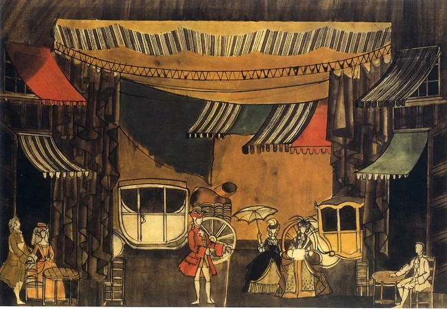
Anastasia (1967)

©The Barry Kay Estate design for Anastasia Act 1 1967
Anastasia was one of the most visually stunning of all MacMillan ballets. Created for his Berlin company, it was inspired by Anna Andersen, who claimed to be the sole Romanov survivor. MacMillan’s expressionist exploration of Anna’s state of mind required projection screens showing episodes from her past. In Barry Kay’s designs, the suspended flat screens became the set, hemming in the action and surrounded by headless dummies dressed to suggest the Imperial family.
In 1971, MacMillan added two acts showing Anna’s childhood and the beginnings of the 1917 Revolution. Kay’s screens now became a swirling vortex which not only evoked time and place, but prefigured the confusion central to Anna’s state of mind in Act III. It was a strikingly imaginative solution to visually unite the three acts while retaining projection screens in Act III.
For Act I, Kay created a lakeside with a restricted tonal range of sepia and cream, the uprights and the shapes on the swirling set suggesting silver birches, it recalled a period photograph (the Imperial family were inveterate snapshotters), and including taking a photograph as part of the action reinforced the idea of a memory preserved. When Bob Crowley redesigned the ballet in 1996, he set Act I on the Imperial yacht, also inspired by images in the family photographic archives.
The costumes showed how right MacMillan had been to admire Kay’s knowledge of period dress. In Anastasia he created soft, flowing everyday dresses for Act I and exquisite formal ball dresses in Act II, especially sensitive to the difference between dressing the adults and the young Grand Duchesses.
Manon (1974)
Manon shows how period costume has to be adapted for dance. The period is established by the non-dancing walk-ons and character roles, who wear theatrical realisations of 18th century dress. Because Manon dances throughout, her costumes have minimal hints of the period, like frilled sleeves and square neckline. Between are the costumes like Lescaut’s in Act I: the coat is 18th century in cut and weight, but for his solos he simply removes it to reveal an ideal dance costume of fitted breeches, shirt and waistcoat.
Original sketch design of Manon Act 1 ©Nicholas Georgiadis Estate
Georgiadis’s sets comment on the action and characters. In Act I, the dancers appear through the rags of the cyclorama, making clear the rich-poor divide that motivates Manon’s actions.
Peter Farmer’s redesigned Manon for several companies, including Australian Ballet, the Kirov/Maryinsky and Vienna.
Classics
The Sleeping Beauty 1967

©Barry Kay Estate
When MacMillan produced The Sleeping Beauty he wanted a clear distinction between the ‘real’ court and the fairy-tale. Kay set Act I in the 1780s and Act III in the 1880s, with the guests behaving as real courtiers on an important state occasion. The costumes were breathtaking, the men in military uniforms and the women in opulent court dresses in predominantly ivory and gold. The fairies’ otherworldliness was suggested by their Faberge-like extravagant ornateness.
The question of redesign
If designs are integral to the finished work, why redesign?
Theatrical works reflect the time in which they are created, the society for which they are conceived, designers and audiences are influenced by outside stimuli, like fashion, interior and graphic design, so a smart, chic design can date after a few years, although, like fashion, they can come back after a time.
A design may be changed if the ballet is mounted on a different stage. Las Hermanas was originally designed by Georgiadis for the large Stuttgart stage, where the set was surrounded by a black cyclorama and drapes, for Western Theatre Ballet, touring to smaller theatres, the set was readjusted to take up all the stage, creating a claustrophobic atmosphere. A 196? television production allowed some of the action to move outside the house, but close-ups maintained the claustrophobic atmosphere. Performed by Sadler’s Wells (now Birmingham) Royal Ballet in the 1970s, the set made effective play of light through shutters, suggesting the outside world from which the family is shut away.
Different audiences may have different references. In 1950s Britain, Solitaire's scaffolding set was very apt at a time when rebuilding was getting under way after World War II, but that reference was not appropriate for Danish audiences when the Royal Danish Ballet danced it in 1961, so Kenneth Rowell took his inspiration from children’s paintings.